Monday, November 29, 2010
Sunday, November 28, 2010
17th Century design influences
Shoes like those seen in the 17th century must have given rise to the shoe fetishes we see in America today. With such variety ranging from bad weather shoes, outdoors shoes and riding boots, or shoes just for fashionable dress wealthy people of the 17th century could easily build a large collection. One of the more interesting pieces of footwear was the shoe rosette. The shoe rosette was an adornment on the top of men’s shoes made out of fabric to imitate a rose. These were of course worn for fashionable dress only and sort of a sign of conspicuous leisure and consumption. What is more interesting is that the rosette was worn by men of the 17th century where today women wear a similar shoe rosette decoration.

The version of the shoe rosette today is mostly placed on sandals or the occasional slipper. The version used here was designed by Giuseppe Zanotti and is much more subtle than its 17th century predecessor. The sandal itself is made of leather as the soles of the earlier were. Skinny black patten straps hold the sandal to the foot with a small buckle around the ankle. The rosette is made of turquoise-blue satin and is more accurate in terms of size. These sandals are worn in much the same respect and are also a sign of consumption and leisure, though not as conspicuous, as they retail for $550. The designer also included an example of what the sandals may be worn with. He suggests a maxi dress and clutch and can be worn for leisure day or night. Though today’s version of the shoe rosette is much more subtle and in my opinion gender appropriate, the similarities are more than obvious.
Tuesday, November 16, 2010
Bigger is better, smaller is economicer?
Apparently since the economy has been falling off so has the average size of houses. In 2007 during the real estate and housing boom, homes averaged 2,100 square feet as compared to now where the average is right around 1,700 square feet. Clearly the cost and economic situation of our country account for the biggest reasons for change, but are there other reason? People now more than ever seem to want things to run efficiently and to not waste. Having a larger home is obviously harder to clean and creates more waste than smaller homes. So having a smaller home would reduce the waste and time spent maintaining. During these times the zeitgeist feels much different than it did just three or four years ago. People are much more conservative in their money spending and seem to be more self aware. The need for simple things and simple designs has replaced the saturation of luxuries that filled the stores and advertisements during the economic boom. Smaller simpler houses are just another design response to what is happening currently in society. At a time when the government seems to be at a loss to help the people or themselves, people move toward becoming self-sufficient and easily sustained home is one step closer.

Monday, November 15, 2010
Ergonomically Speaking...
As a design major I have had the opportunity to use many different tools to create many different projects. I have used everything from electric power tools like chop saws to computer software like photoshop to aid in my creation. After using certain tools for any time at all you begin to notice the ergonomics of the tool in hand. When considering the ergonomics of a tool or product we first look at safety or how safe the thing is to use followed by comfort, then ease of use, after that the performance, and finally the aesthetics.
One tool I use as often as any other and comes to mind immediately when considering ergonomics is the razor knife or Exacto knife. I think of this tool more for reasons of bad ergonomic design more so than good. There are many different versions of the knife but the most common one and the one I have in mind in the most basic round-handled knife with an exposed blade and a small grip that twists to loosen or tighten the blade in the handle shown here.

One tool I use as often as any other and comes to mind immediately when considering ergonomics is the razor knife or Exacto knife. I think of this tool more for reasons of bad ergonomic design more so than good. There are many different versions of the knife but the most common one and the one I have in mind in the most basic round-handled knife with an exposed blade and a small grip that twists to loosen or tighten the blade in the handle shown here.
Right out of the gate there is some concern over safety considering the blade of the knife is actually exposed. Most knifes like this come with some sort of hard plastic covering cap but your lucky to not lose or break it leaving your knife blade permanently exposed. This is not a good idea since the blades on these knives are so sharp you usually won't even know when you cut yourself until you see the blood. Even the cheapest smallest upgraded knives all have retractable blades, probably because they looked at or used this one and realized the issues of safety involved.
Everyone knows how uncomfortable a straight pen or pencil can become after only a few sentences of writing. Often the utensil will even leave indentations in sides of the user's fingers where they come into contact with each other. This is why there are so many different options for pens and pencils with custom grips and shapes designed for comfort. After all if you're going to be holding something in your hand, you want it to feel good and be comfortable. Well apparently this company decided to ignore all that and leaves us with a hard, cold, straight metal handle with tiny grip that feels like metal sandpaper. Using this design is like writing a 10 page paper nonstop with a straight pen, painful.
When it comes to actually using the tool there's not much to it although the uncomfortably small handle does make it more difficult to control than need be. When using this knife in comparison to knives with larger handles and blades with more surface area, its more likely for this one to turn in your hand and move away from any guides or cause inaccuracies. This makes the chances for mistakes and injuries much higher. For lacking in all other layers of functionality, changing and replacing blades on this knife is easier than most others requiring only the loosening and tightening of the handle. Overall the knife does what it is designed to do and does it very well. It can cut long straight lines with a perfect edge in softer thinner materials like paper, wood, and some plastics. To maintain the sharp edge the blades must be replaced often but they are cheap and easy to replace and will last a decent amount of time depending on the material being cut.
There's little to this simple tool. There are three separate parts that make up the object and they are all more or less the same color and material. The handle and grip are the same shape and only differ in texture while the thin triangular blade stands on the end. It is very sleek and compact making it easy to carry and doesn't take up much space in a tool box/bag. Overall the knife's simple design does fulfill it's simpler function, but minimally. The knife lacks in comfort and in turn affects the ease of use and performance and makes this tool a dread to use. Simple upgrades and changes can be found in many other cheap variations making this knife a last resort in my tool box.
Monday, November 8, 2010
Salty...
Apparently Planters Peanuts has decided to give their old mascot Mr. Peanut a new look. Much like the Gap logo discussed earlier this year, it has been seen on the internet first and subjugated to EVERYONE'S opinion. This is an example of the instant feedback companies can receive from the public and consumers made possible by the ever so wonderful internet. Of course with every change to an old idea that has been successful, people have their negative things to say about 'new' design. For how much they have changed they haven't changed much in my opinion, if that makes sense. The biggest change comes from giving the peanut a voice which it has never had since its creation in 1916 and will be provided by a Mr. Robert Downey Jr., arguably the biggest name in Hollywood at the moment. The style of animation or artistic convention is the other biggest change moving Mr. Peanut from a flat 2D bright yellow image to a 3 dimensionally rendered peanut who's color is much closer to that of an actual peanut. Apart from those differences he still retains his monocle, top-hat, and cane and reminds us to stay as classy as we were in the 20s.
  I would venture to say that this revamp is an attempt by the planter's peanut company to try and reconnect with a younger audience by using fun 3D animation and giving him a voice that we all will recognize. Not to mention that Downey is a poster-boy of cool and classy like the dandy Mr. Peanut was back in the 20s when he was gaining his popularity. I don't doubt that having this fun, textured, new look combined with Downey's swag will at least spark a few conversations about planters and their new Mr. Peanut which is all their looking for anyway. I do doubt that people, despite their negative comments, will stop buying peanuts based solely on this new design. |
ImageWord - WordImage - Logos
Thinking about how images and words interact at the simplest level brings you to a situation where you have one image and one or possibly a few words. Most of these situations occur in business and company logos. In a world where we are surrounded by advertisements and company logos a business has to be able to communicate to the public quickly, clearly, and efficiently who they are and what they're all about in a few seconds with a logo and their name or a slogan. In my last post about Fie's lecture I said that using words and images together was a great way to deliver ideas and information quickly and efficiently in the form of comics and graphic novels and the same seems to apply here. The only difference is rather than the words and images working together as separate things to create an experience, in a logo the image and word almost become one in the same like the signified and signifier. The best example I can think of is Nike.
 When the company first started advertising with this logo out I'm sure the word Nike was next to or under the famous swoosh until they became well known and now when you hear or see the word Nike you picture the swoosh or vice versa when you see the swoosh you automatically think Nike. So in a way Nike created its own 'dog' in terms of the signified and signifier that everybody can read and understand. In creating this symbol Nike has created a way for consumers to instantly recognize their brand just as quickly as you can hear the word dog and picture one in your head. Having that instant connection and recognition makes you feel comfortable in what you're purchasing and trusting that the company who has put their mark on the product has sold you something they can stand behind because they as a company have created this entity through their logo that can be held responsible for any unhappy experience the consumer may face from use of the product. In short the relationship of images and words are imperative when used in logo design to quickly connect and inform consumers of a companies worth and integrity.
Image and Word: Fies' Lecture
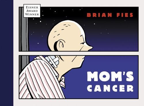
Graphic novelist Brian Fies delivered a lecture based on his comics Mom's Cancer and Whatever Happened to the World of Tomorrow where he spoke about the relationship of image and word and how they work together to create an experience for the reader/viewer. He talked about how our memories work and how they are actually a lot like comics. When you think in your mind your basically talking to yourself and creating the narrative while your mind is producing images that correspond with each memory. Combining words and images can help communicate ideas or feelings in ways that obviously just words or pictures alone can't. There are always times when words fall short of what we really mean and often times there is too much room for interpretation in an image alone. In comics and graphic novels words and images and equally important in creating a specific moment or feeling or idea. I feel like using words and images together is necessary when there is less room for interpretation and when someone really needs to communicate something clearly and concise so that the viewer/reader has the best possible chance of understanding what the author/creator is feeling/saying. For example when you look at an image by itself it may or may not have a narrative but you can certainly give it one after looking it over and giving a quick analysis. And if you're reading a book it may be descriptive but your mind still produces its own images that are most likely different from some one reading the same book. But when you combine words and images they create a more complete picture that has more restrictions in terms of interpretation. While I was searching for an example of Fie's comic I found this, http://www.brightoutcome.com/brightoutcome_patients.html where a healthcare provider used his comic to show the lack of communication between the doctors and patients.

Even the healthcare system understands that using words and images together is a great way to clearly communicate important ideas and information. In terms of design there's no question of whether the use of words and images is a good thing or a bad thing, more of whether or not its appropriate in the given situation and successfully delivers the author's message.
Monday, October 4, 2010
Bad Commercials, Good Design?
It seems to me that the most annoying thing about any radio or TV programming is the commercials. Most the time I just change the channel or turn the radio off when they start but when I do listen or watch the only ones I ever remember for long time are the ones that are just terrible. Its great when a funny or intelligent commercial comes along but they don't stick like the really bad ones. It makes me wonder if a terrible commercial with a ridiculous jingle is a more successful design for an advertisement than a brilliant idea or hilarious punch-line. More often than not its local commercials who obviously don't have a huge budget for advertising so they throw something together using what little resources they have and voila we're blessed with a terrible commercial that makes you want to turn the TV off and ask the people wtf they were thinking? But that stupid commercial was so bad or so annoying that you just won't forget it, not for months probably. I use the General car insurance image as an example because of they're awful jingle and cheap 3D graphics they use in their commercials. Both of these are so bad that the General I think will forever be stuck in my head.
 We know advertising works otherwise companies wouldn't spend millions on it, so I wonder how effective a commercial is that is just so terrible you can't forget it.
Design in Society
Design is everywhere in our society. Everywhere we look design is affecting us and we are affecting design. From the clothing we wear to the buildings that surround us all are 'designed' with a purpose or function. Once you realize what design is and how much of our society is actually designed it can almost be overwhelming and hard to decide what is and isn't design. Almost anything that is man made seems to have some designing involved. Even a blank wall has a design aspect because it probably has some kind of paint or texture applied to it to make it look good. Why is this? I think its because we as humans have a desire for things to be aesthetically appealing. So in society, we as designers make things in order to appeal to the majority of the people because they're who make our designs popular. In a way society helps shape design since the designers are a part of society. At the same time design is designing for society, designers are also pushing society in new or different directions.
First Encounters of Design with Dr. Seuss

Subscribe to:
Comments (Atom)